

Building my blog, part 2: the reader's experience
From the figueirego identity to the Archive, search, and comments: the choices behind a simple blog in two languages.
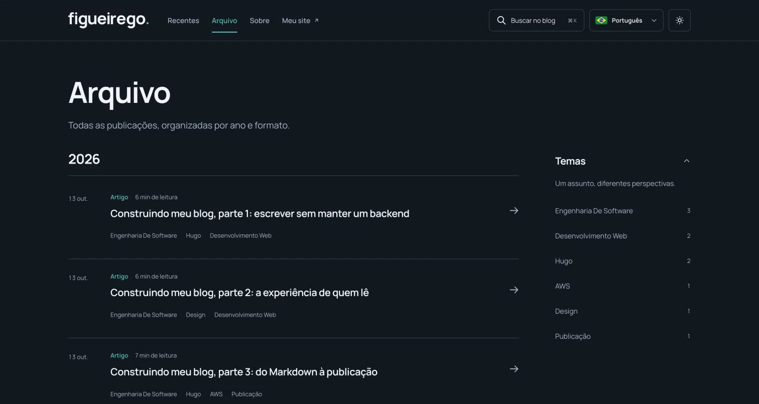
Editorial note: This series documents the initial Hugo blog, which was separate from the portfolio. The unified version of the site brings both together at figueirego.com, with the blog under
/blog/(English) and/pt/blog/(Portuguese). The navigation and screenshots below document that initial stage.
A reader arrives looking for a piece of writing. They might remember its subject, want to see what I have published recently, or have followed a link. The blog needs to support those paths without requiring anyone to understand how I organize my files.
This was the most iterative part of the build. I wanted the simplicity of the approach Akita described, with my website’s identity and an experience of its own. Colors and fonts were the starting point; the more consequential decisions involved navigation, search, and comments.
In part one, I explain the architecture. Here, the focus is what happens after the page opens.
Keeping the figueirego identity
I used the SVG wordmarks already present on my website, with versions for light and dark backgrounds. This preserves the actual shape of the logo. Manrope handles headings, interface text, and prose; JetBrains Mono handles code. The blog serves the font files itself.
Petroleum green identifies links and actions in the light theme. In dark mode, the accent becomes a lighter turquoise so it remains visible against the background. Subtle surfaces, dividers, and spacing organize the content.
The header received the glass effect I also wanted on my website: a translucent background, blur, and a light border. It falls back to a solid surface when the browser lacks support or the visitor prefers reduced transparency. The effect should support reading, not make it harder.
Four paths in the header
Earlier versions put Articles, Notes, and Experiments at the top. As Responses and Transcripts joined them, putting every format in the header would make the navigation compete for space, particularly on a phone.
In the standalone version described here, the final navigation had four destinations:
- Latest: all publications, newest first.
- Archive: the complete collection, with filters to find a particular entry.
- About: my introduction and links to find me elsewhere.
- My website: figueirego.com in the corresponding language.
External links open a new tab. Navigation within the blog stays in the current one. On phones, the header rearranges its controls and navigation into rows while retaining touch targets and accessible labels.
Format and topic answer different questions
An article about Go can share its subject with an experiment or a response to a reader. That is why I kept formats separate from topics:
| Format | Intended use |
|---|---|
| Articles | Develop an idea, decision, or process with context. |
| Notes | Record a shorter observation or something learned. |
| Experiments | Document an attempt, its setup, and the observations. |
| Responses | Develop a question received on social media or in comments. |
| Transcripts | Publish text versions of my videos and conversations. |
Topics are tags: software engineering, learning, Go, and other subjects that emerge from the writing. An entry can belong to several topics without being copied into several places.
In the Archive, readers can combine format, year, topic, and a text query. Filters are preserved in the URL, so the selection can be shared and browser back and forward continue to work. Without JavaScript, the complete list remains available. Topic counts come from published content; I did not fill the interface with demonstration numbers.
Images help when they serve a purpose
I liked the idea of showing covers on posts. They can make an entry easier to recognize and introduce a concept, such as a workflow or an architecture. I kept them optional: a short note may work perfectly well with a title and text alone.
The newest publication receives more space on the home page. The others follow with a title, summary, and metadata, plus a thumbnail when a cover exists. On the article page, the image appears in full, with alternative text and a caption when provided.
I also record its dimensions to reserve space before it loads. To explain this build, I chose actual screenshots of the process. This part’s cover shows the Archive in the local preview, with articles from this series. The caption identifies the environment: a local screenshot can show the interface, but it does not prove that version is already published.
Search needs to find what is in the text
During the revisions, search became a point of attention. The button needed to be easy to notice, open reliably, and find more than titles. A good-looking control that gets stuck interrupts the reader’s path.
The implementation uses FlexSearch in the browser, with an index for the current language. It considers titles, descriptions, summaries, tags, and full text. Accent normalization lets a Portuguese reader search for publicacao and find content containing “publicação.” The button and Ctrl+K or ⌘K open the dialog.
There are two search tools with different jobs. The Archive field filters its list using titles, summaries, and topics. The header search also looks inside articles. Someone who remembers a passage about translationKey can use the latter to find this post.
Local search follows the content generated by Hugo. It requires JavaScript in the browser but does not require me to operate a search server.
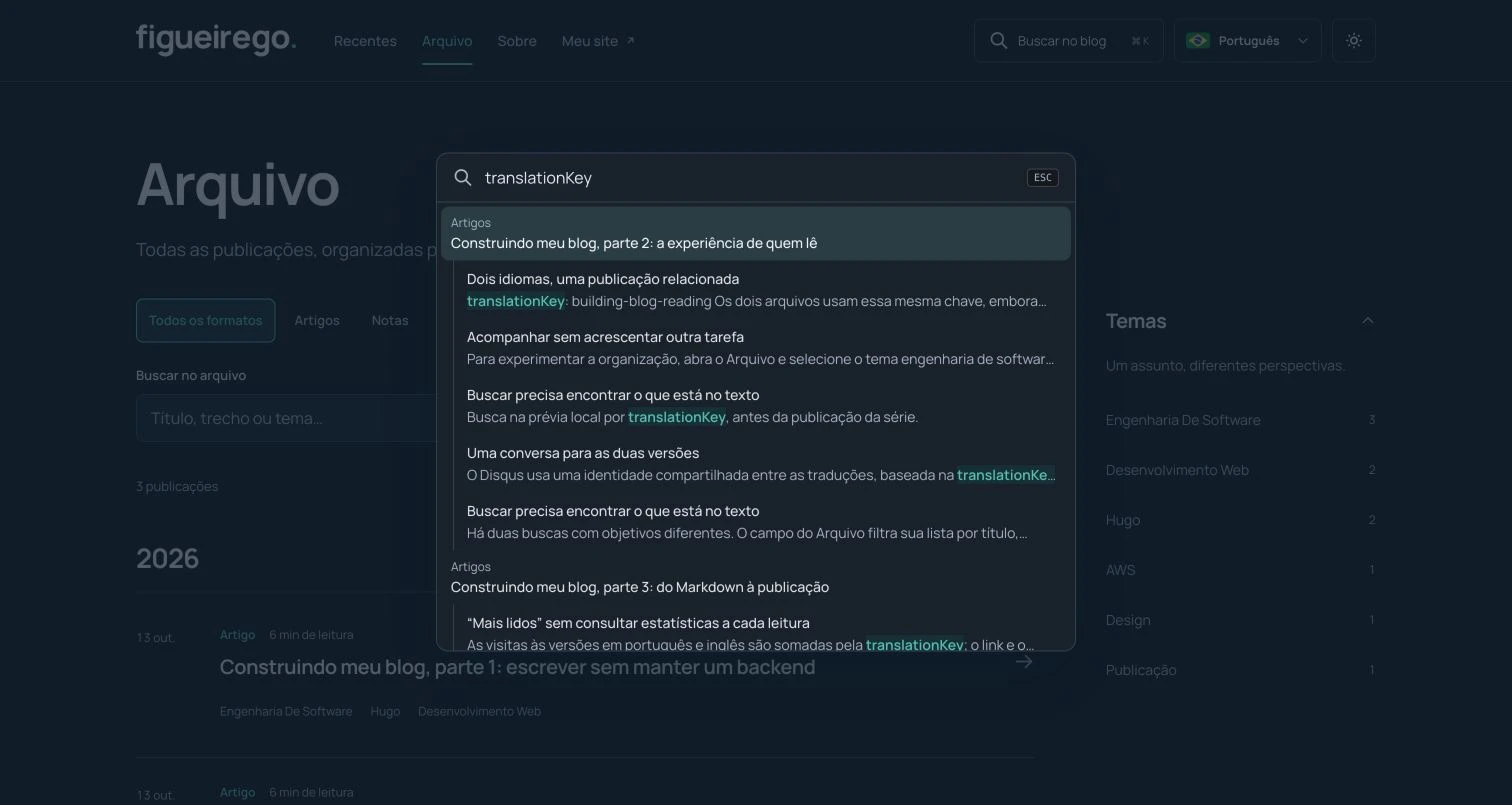
Searching the local preview for translationKey, before publishing the series.
Two languages, a linked publication
In that version, English lived at the root of blog.figueirego.com; Portuguese lived under /pt/ on the same subdomain. Each version has its own Markdown file. The language selector opens the corresponding translation when one exists; clicking it does not translate the text.
The relationship between this article’s versions is explicit:
translationKey: building-blog-readingBoth files use the same key, even though their titles and URLs differ. That allows the translation to be edited as a piece of writing in its own right. It also means an editorial correction needs to be considered in both languages.
Language does not determine appearance. By default, the theme follows the system. One click switches between light and dark and saves the preference in that browser. Icon transitions respect the reader’s reduced-motion preference.
One conversation across both versions
In the initial test, switching languages could lead to a different discussion. For the same article, I preferred shared comments: English and Portuguese readers can participate in the same conversation.
Disqus uses an identity shared by the translations, based on the translationKey. Its interface follows the page language. Each person’s comments remain in the language in which they wrote them.
Comments load automatically on eligible production publications. If loading fails, a retry option appears. The local preview does not open the live discussions.
Theme changes required an extra precaution. The Disqus editor lives in an iframe from another domain. After a reader interacts with it, the blog preserves the component when changing theme because it may contain an unsent comment. It offers a manual refresh instead. Readers should submit or copy their text before using that option.
This is an external integration, with its own moderation, appearance settings, and advertisements on the selected plan. A static blog still has dependencies; it simply means I do not maintain a comments backend myself.
Following the blog without another task to manage
I kept RSS in the footer, with a page that explains it and lets readers copy the feed address. Published entries from all five formats appear in their language’s RSS feed. Anyone using a feed reader can follow new posts there.
The newsletter is left out for now. Most read depends on real data, which I cover in part three, on publishing and operations.
To try the organization, open the Archive and select software engineering. Then search for translationKey from the header and switch this article’s language. Those paths provide a more useful test of the interface than a screenshot of the home page alone.
Building my blog series: 1. Architecture · 2. Reading experience · 3. Publishing and operations.
Comments
Continue the conversation on Disqus.
The blog theme changed. Send or copy any draft before refreshing the comments.